7. Visualization#
As presented in the Fundamentals, pyGIMLi offers some basic post-processing routines for plotting. For 2D and 3D visualizations, we rely on Matplotlib and pyVista, respectively, and provide the following frameworks:
Drawing functions using Matplotlib. |
|
Pyvista based drawing functions used by pygimli.viewer. |
In the following, we will give a brief overview on the most important aspects on visualizing your plots as well as performing simple (cosmetic) changes.
7.1. Plotting in 2D#
For plotting in 2D, the method pygimli.viewer.showMesh() is called, which creates an axis object and plots a 2D mesh, if provided with node or cell data. As already discussed in the fundamentals section, the type of data determines the appropriate draw method.
This matplotlib glossary comprehends all possible adjustments that you can apply to plots based on pg.show(). In the following table, we summarized the most relevant functions:
|
Add text to the Axes. |
|
[Discouraged] Add an arrow to the Axes. |
|
Convenience method to get or set some axis properties. |
|
Hide all visual components of the x- and y-axis. |
|
Do not hide all visual components of the x- and y-axis. |
|
[Discouraged] Invert the x-axis. |
|
[Discouraged] Invert the y-axis. |
|
Set the x-axis view limits. |
|
Set the y-axis view limits. |
|
Set the label for the x-axis. |
|
Set the label for the y-axis. |
|
Set a title for the Axes. |
|
Place a legend on the Axes. |
|
Set the aspect ratio of the Axes scaling, i.e. y/x-scale. |
|
Set how the Axes adjusts to achieve the required aspect ratio. |
|
Set the xaxis' tick locations and optionally tick labels. |
|
Set the yaxis' tick locations and optionally tick labels. |
|
Share the x-axis with other. |
|
Share the y-axis with other. |
7.1.1. Plotting meshes and models#
As described in the Fundamentals section, pygimli.viewer.show() and pygimli.viewer.showMesh() utilize a variety of drawing functions, depending on the input data provided. In the following, we will take a look at how to manually access the necessary drawing functions to plot an empty mesh, as well as cell-based and node-based data.
import numpy as np
import matplotlib.pyplot as plt
import pygimli as pg
from pygimli.viewer.mpl import (
    drawMesh, drawModel, drawField, drawStreams, drawSensors,
)
import pygimli.meshtools as mt
To visualize a grid or a triangular mesh in 2D, we can simply make use of the pygimli.viewer.show() function, which refers to pygimli.viewer.mpl.drawMesh():
n = np.linspace(1, 2, 10)
mesh = pg.createGrid(x=n, y=n)
fig, ax = plt.subplots()
drawMesh(ax, mesh)
plt.show()
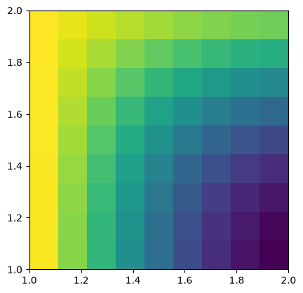
If we now want to plot cell-based values on top of our mesh, pygimli.viewer.show() links to the function pygimli.viewer.mpl.drawModel():
mx = pg.x(mesh.cellCenter())
my = pg.y(mesh.cellCenter())
data = np.cos(1.5 * mx) * np.sin(1.5 * my)
fig, ax = plt.subplots()
drawModel(ax, mesh, data)
plt.show()
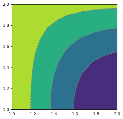
Similarly, for scalar field values, the function pygimli.viewer.mpl.drawField() is utilized:
nx = pg.x(mesh.positions())
ny = pg.y(mesh.positions())
data = np.cos(1.5 * nx) * np.sin(1.5 * ny)
fig, ax = plt.subplots()
drawField(ax, mesh, data)
plt.show()
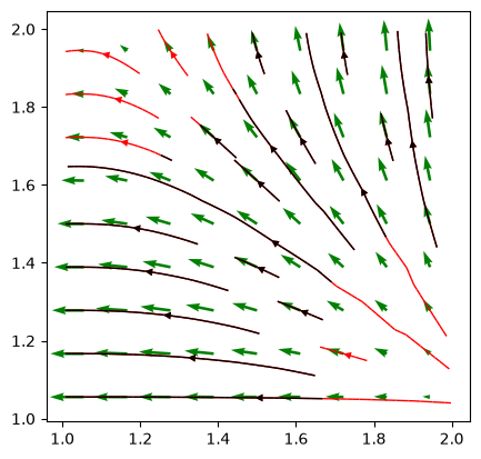
pyGIMLi also allows to plot vector field streamlines with pygimli.viewer.mpl.drawStreams, as in the following example. Every cell contains only one streamline and every new stream line starts in the center of a cell.
fig, ax = plt.subplots()
drawStreams(ax, mesh, data, color='red')
drawStreams(ax, mesh, data, dropTol=0.9)
drawStreams(ax, mesh, pg.solver.grad(mesh, data),
            color='green', quiver=True)
ax.set_aspect('equal')
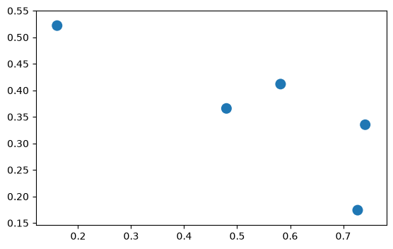
A more specific case is the visualization of sensor positions, which is also covered by a drawing function within the visualization framework of pyGIMLi. By providing a list of sensor positions to plot as [x,y] pairs, the function pygimli.viewer.mpl.drawSensors()draws the sensor positions as dots with a given diameter.
sensors = np.random.rand(5, 2)
fig, ax = pg.plt.subplots()
drawSensors(ax, sensors, diam=0.02, coords=[0, 1])
ax.set_aspect('equal')
7.2. Plotting in 3D#
For plotting in 3D, pyGIMLi utilizes the pygimli.viewer.pv module, which leverages the capabilities of pyVista for rendering. The primary function for visualizing 3D meshes is pygimli.viewer.pv.drawMesh(), which can handle various types of 3D data, including cell-based and node-based data. Similar to 2D plotting, the type of data provided determines the appropriate drawing method. As for the 2D plots, we can fine-tune the 3D plots by referring to the pyvista.Plotter functions
The following examples demonstrate how to plot 3D meshes, cell data, and streamlines, as well as how to create slices through the mesh for detailed analysis.
7.2.1. Plotting meshes and models in 3D#
Plotting meshes using pyVista is straightforward with pyGIMLi. The pygimli.viewer.pv.drawMesh() function is called to visualize 3D meshes and models, leveraging pyVista’s powerful rendering capabilities.
from pygimli.viewer import pv
plc = mt.createCube(size=[40, 20, 15], marker=1, boundaryMarker=0)
cube = mt.createCube(size=[15, 15, 8], marker=2, boundaryMarker=0)
geom = plc + cube

mesh = mt.createMesh(geom, area=4)
pg.show(mesh, style='wireframe', showMesh=True)
Opening /tmp/tmppxlm1vp1.poly.
  Segments are connected properly.
(<pyvista.plotting.plotter.Plotter at 0x14fe529a10d0>, None)
To visualize cell-based values in a 3D mesh created with pyVista, pg.show makes use of the pygimli.viewer.pv.drawModel() function, which draws a given mesh together with provided values:
mx = pg.x(mesh.cellCenter())
my = pg.y(mesh.cellCenter())
mz = pg.z(mesh.cellCenter())

data = mx

pg.show(mesh, data, label="Cell position x (m)")
(<pyvista.plotting.plotter.Plotter at 0x14fe284d2150>, None)
As for the 2D section, pyVista also allows to plot streams by taking vector field of gradient data per cell. The according function is utilized in the example below:
ax, _ = pg.show(mesh, alpha=0.3, hold=True, colorBar=False)
pv.drawStreamLines(ax, mesh, data, radius=.1, source_radius=10)
ax.show()
Creating slices in a 3D plot allows for detailed analysis of the internal structure of the mesh. The pygimli.viewer.pv.drawSlice() function can be used to create and visualize these slices, specifying the normal vector and cell values to be displayed.
ax, _ = pg.show(mesh, alpha=0.3, hold=True, colorBar=False)
pv.drawSlice(ax, mesh, normal=[0,1,0], data=data, label="Cell position x")
ax.show()
If you want to take a look at more practical applications and examples that fully use the plotting capabilities of pyGIMLi, please refer to the examples section.
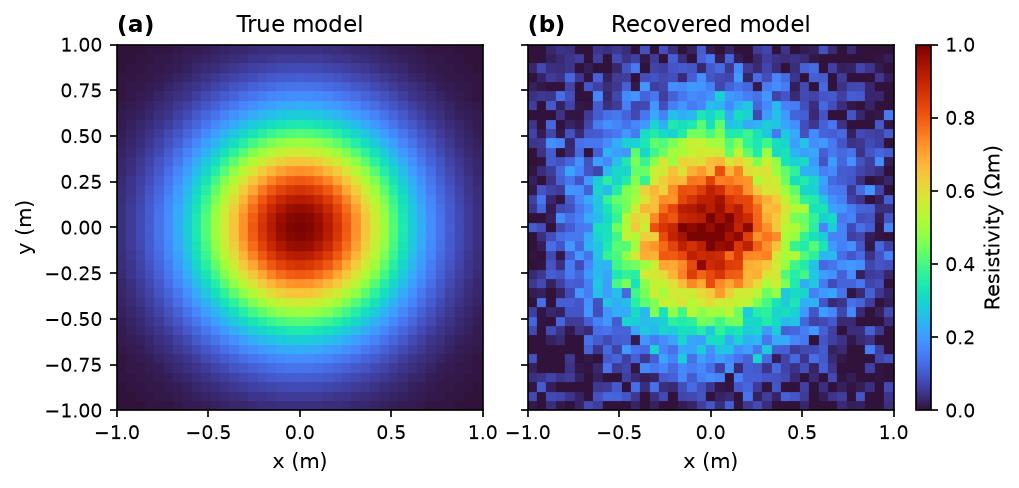
7.3. Publication-ready figures#
pyGIMLi’s high-level pg.show() creates a single-panel figure with its own
colorbar attached. For a publication we typically want several panels in one
figure, a single shared colorbar and font sizes matching the surrounding text.
The underlying draw functions (pygimli.viewer.mpl.drawModel,
drawField, …) give us the required control: each of them draws into an
existing axes and returns a Matplotlib graphics object (a PolyCollection)
that we can hand to a shared colorbar. To arrange the panels themselves we use
Matplotlib’s ImageGrid,
which keeps all panels at equal aspect ratio and reserves a dedicated slot for
the shared colorbar.
Relevant Matplotlib building blocks are:
ImageGridfor a grid of equal-aspect axes with a single shared colorbarAxes.set_titleandAxes.set_xlabelfor panel and axis labelsmatplotlib.rcParamsto apply a consistent typography to every figure of a paper at once
The example below draws a two-panel figure — a “true” and a “recovered” model
on the same mesh — with one shared colorbar and “(a) / (b)” panel labels
typical for geophysical publications. Rather than repeating fontsize=… on
every call, a small rcParams
block at the top of the cell sets the typography of the whole figure at once —
put the same block at the top of your notebook and every subsequent figure of
a paper will match:
from mpl_toolkits.axes_grid1 import ImageGrid

# Some plot settings
plt.rcParams.update({
    "font.size": 9,        # base size (ticks, colorbar labels, …)
    "axes.labelsize": 10,  # x/y axis labels
    "axes.titlesize": 11,  # panel titles
    "figure.dpi": 150,
})


# Create some dummy mesh and models
rng = np.random.default_rng(0)
n = np.linspace(-1, 1, 40)
mesh = pg.createGrid(x=n, y=n)
mx = pg.x(mesh.cellCenter())
my = pg.y(mesh.cellCenter())
true_model = np.exp(-(mx**2 + my**2) / 0.3)
recovered = true_model + 0.05 * rng.standard_normal(mesh.cellCount())

vmin, vmax, cmap = 0.0, 1.0, "turbo"

# Two panels + one shared colorbar via ImageGrid
fig = plt.figure(figsize=(7, 3.2))
grid = ImageGrid(
    fig, 111,
    nrows_ncols=(1, 2),
    axes_pad=0.3,
    share_all=True,
    cbar_mode="single",
    cbar_location="right",
    cbar_size="4%",
    cbar_pad=0.15,
)

gci_a = drawModel(grid[0], mesh, true_model, cMin=vmin, cMax=vmax)
gci_b = drawModel(grid[1], mesh, recovered,  cMin=vmin, cMax=vmax)
for gci in (gci_a, gci_b):
    gci.set_cmap(cmap)

for ax, letter, label in zip(grid, "ab", ["True model", "Recovered model"]):
    ax.set_title(f"({letter})", loc="left", fontdict={"fontweight": "bold"})
    ax.set_title(label)
    ax.set_xlabel("x (m)")
grid[0].set_ylabel("y (m)")

cbar = grid.cbar_axes[0].colorbar(gci_a)
cbar.set_label(r"Resistivity ($\Omega$m)")
plt.show()
Finally, export the figure in a vector format for publication-quality output:
fig.savefig("figure.pdf", bbox_inches="tight")
7.4. External plotting#
If you ever encounter the situation that the plotting capabilities of pyGIMLi are too limited for your need and you want to use more powerful programs such as Paraview, you can easily export meshes and models from pyGIMLi.
The VTK format can save values along with the mesh, point data like voltage under POINT_DATA and cell data like velocity under CELL_DATA. It is particularly suited to save inversion results including the inversion domain in one file.